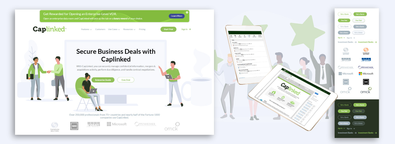
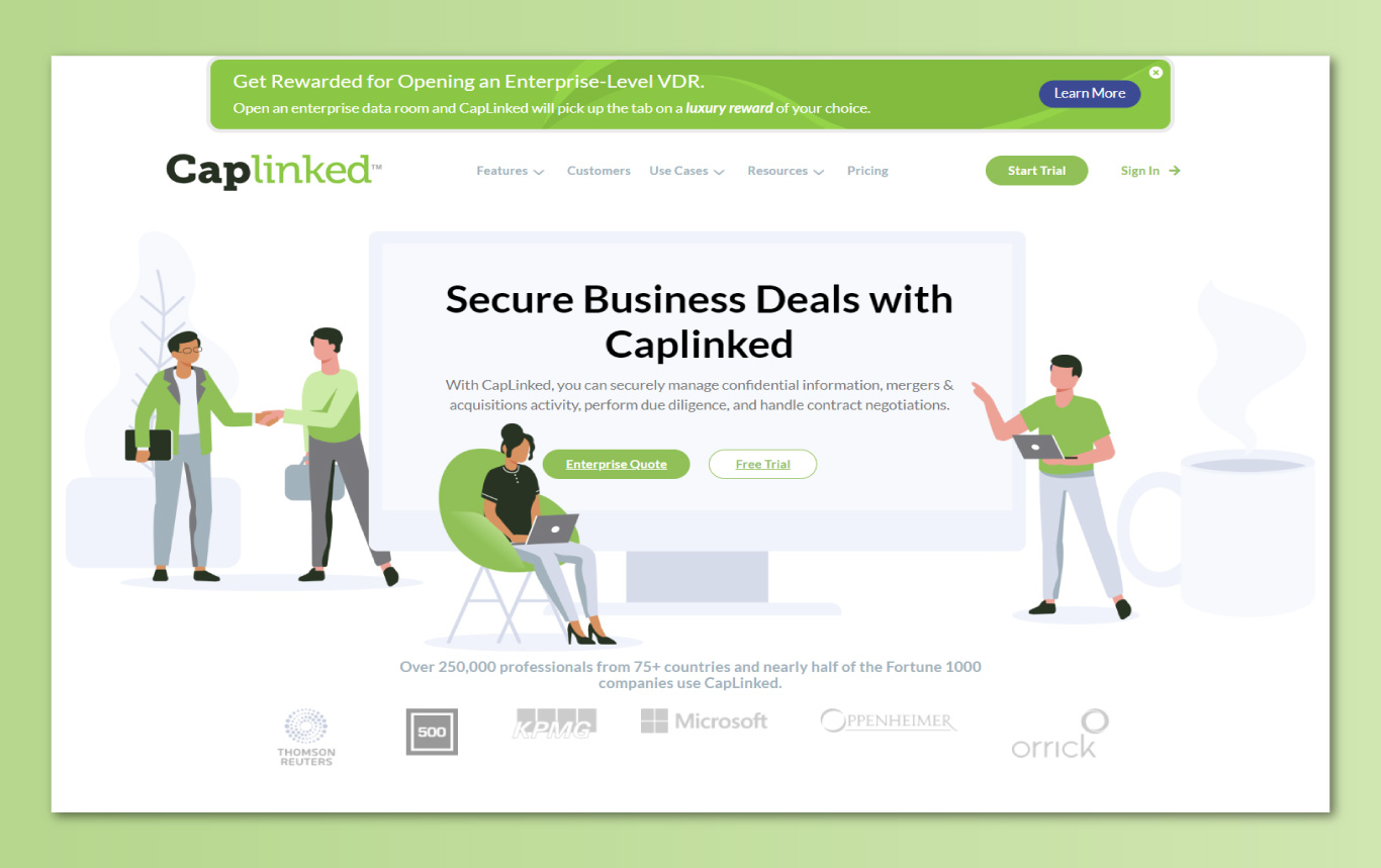
Caplinked is a SaaS that allows businesses to securely manage confidential information, mergers & acquisitions activity, perform due diligence, and handle contract negotiations. Over 250,000 professionals from 75+ countries and nearly half of the Fortune 1000 companies use CapLinked to securely transfer files.
Role: Lead Designer, Part of a Cross-Functional Team
Sector: SaaS, B2B, Security, Data Transfer
Time: 12 Weeks
User Group: Businesses, Fortune 500 Companies, Finance, Law Firms, Venture Capital, Private Equity
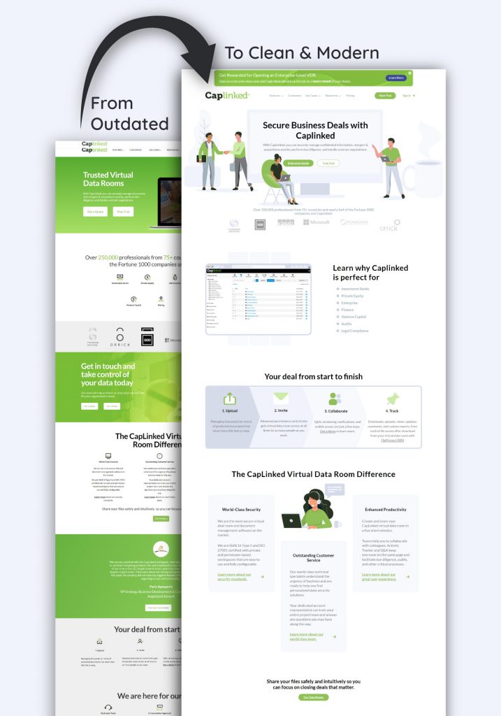
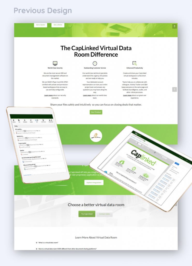
Founded in 2010, Caplinked’s first-class software stayed up to date, but its design of the website and app hadn’t been updated since the start of the company. Rising competitors in the industry had newer designs that appeared more “tech savvy.” This risked Caplinked’s status as the industry leader.
Main Takeaway: a new, modern, tech-savvy, style was needed immediately for their website and product.
First Impressions
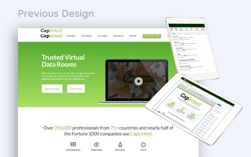
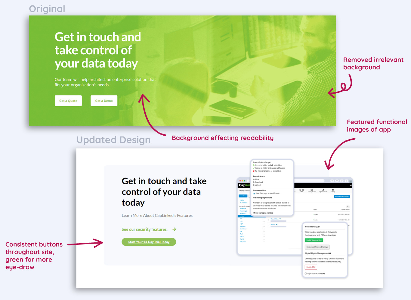
The website is very word heavy. Text is smaller than would be easily legible. Section widths are inconsistent in a way that feels unintentional. Callouts to existing clients are good and build consumer trust but should be focused on and highlighted near the top of the page. CTAs are limited, lacking interest and focus. There’s no real incentive for me to click on anything. There’s no way for me to preview the product except in a video in the top of the page, no images or other media that show me what this product is. Overall the design could be significantly better and more product focused.
The app leaves a lot to be desires. While hierarchy is generally pretty good, there’s places where it could be improved pretty significantly. Focus needs to be on what parts of the app users are most frequently utilizing and making sure those are easier and quicker to access. Styling looks much older than even the website. Colors are inconsistent as are icons, which can add to confusion from users. A lot of improvement could be made by updating aesthetic into something more familiar.
Because of the existing customers adjusting user flow will be difficult and should be limited to only extremely important changes. Changes to user flow should be small and gradual, coming in phases to help users keep up with changing design.
Discovery
Caplinked already had a large, existing user base to pull data from. Because they wanted both website and product to be updated we needed to interview customers about their needs for both.
The website’s primary function is to get new users to try the product. It’s secondary function is to help existing users find the answers to questions they might have about the product. Customers we interviewed agreed with this assessment.
The app’s primary function is to allow files to be transferred securely and easily. As security is primarily a development issue, my job was to focus on how the design of the product might effect the ease of use only.
Cross-Functional Team: For this project I had access to a project manager, a copywriter, an SEO specialist, and a development team. I also had access to three members of Caplinked’s team to help me gather data and insights as well as to connect me directly to their users, and provide me feedback as the process continued.
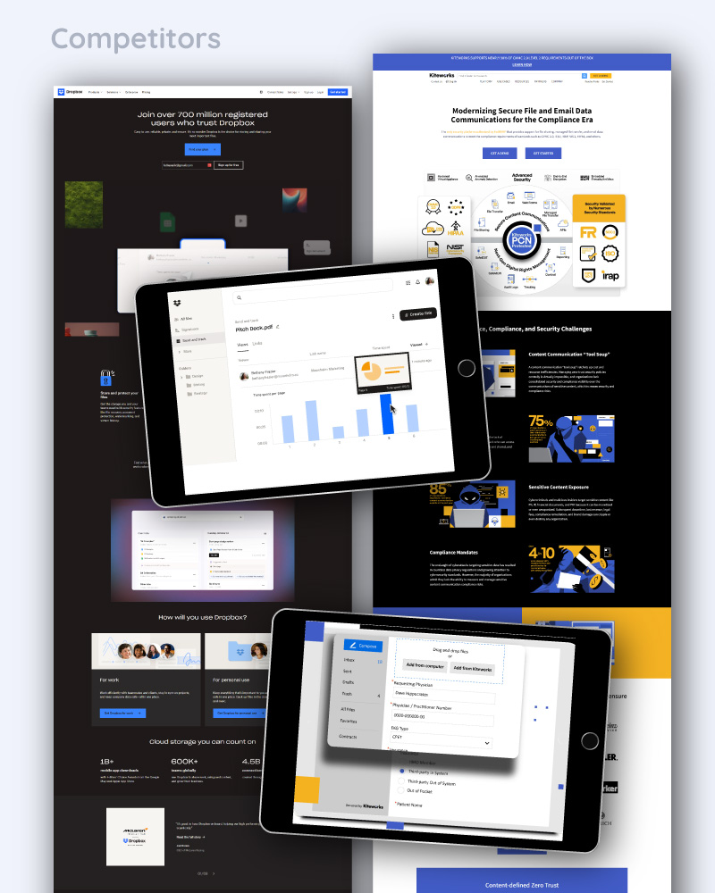
Competitor Analysis
A few takeaways:
Dropbox: Dropbox is a file-sharing giant in the industry. Their website features a lot of effective CTA’s. There are a lot of product images mixed in among the text. Their copy is shorter with lots of white space. Animations help lead the eye down the page. While the homepage utilizes a dark theme, the rest of the site still utilizes a light theme. The app is very clean with minimal color usage, only for the most important aspects. Icons and text menu adds clarity for both small and large window sizes. Features and file menus are separated, but on the same left side menu allowing for clarity and ease of use. The audience is slightly different. Caplinked can push its security features to capture the more specific audience.
Kiteworks: A significantly busier site style that still features effective CTA’s from the hero throughout the site. The site pushes starting with a demo, similar to Caplinked, and pushes the security features. Few images of the app are featured, to Kitework’s detriment. The app is similarly an older style as Caplinked’s is. This makes Kiteworks a more direct competitor, but an easy one to improve upon design-wise and gain more trust of similar clients.
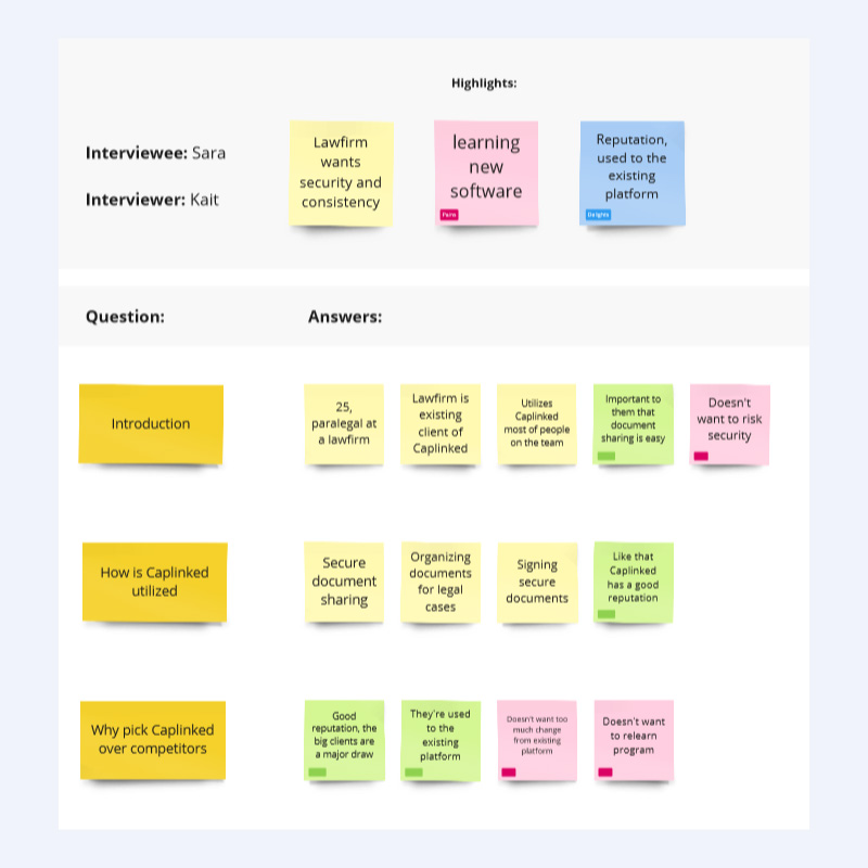
User Research
Having access to customers meant that surveys could be sent out. The survey included two sections, one for app research and the other for website research. The focus of these surveys was on what features users wanted, what features users used most frequently, what their journey was through the website and app.
Because this is an existing app with current customers I could also utilize the most commonly reported problems among existing users to inform design.
Both of these told me to focus on the sitemaps for both as the menus for both the app and website were large and confusing.
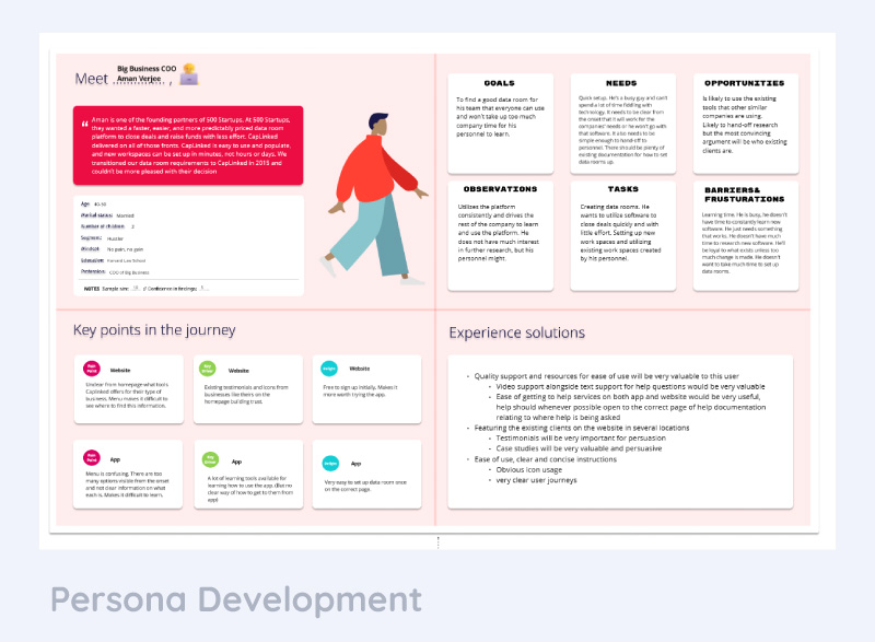
Persona Development
ICPs (Ideal Customer Profiles) were developed for Caplinked to be able to focus on the most important customers existing in the app and the customers who were the best sales focus based on the product and competitors.
We learned the primary customers to focus on were large businesses, law firms, investment banks, and venture capital. They wanted easy to access information for their most used features (which varied by type of customer), and a clearer journey through the app.
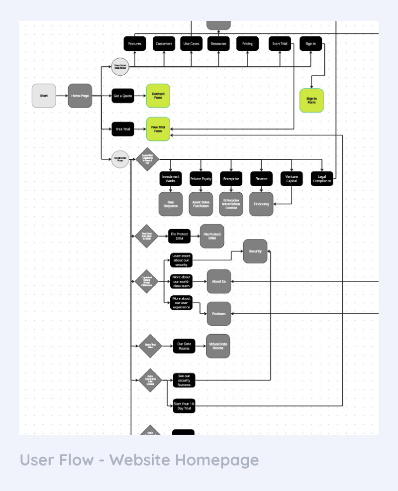
User Flows
Website
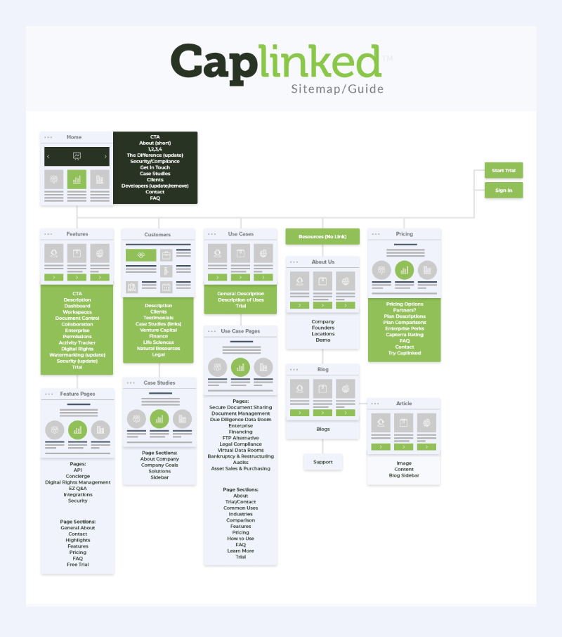
User flows became complicated very quickly for this product. The website had over 30 unique pages that needed to be redesigned.
Problem #1: To retain SEO pages could not be removed and copy changes were limited to the homepage. This meant that for the most part I needed to retain the existing complicated user flow. I could change the menu so that the page organization was clearer, but I was limited in changing the way the pages linked internally.
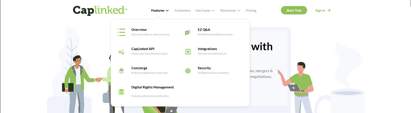
To simplify the user flow I opted for nested menu items. This made the secondary menu extremely long and potentially confusing to customers, but made the initial menu significantly simpler. This made it so that at a glance a user could find the general concept of what they were looking for, rather than having to go through 30 links.
Problem #2: Now the secondary links were presenting in a long list, with confusing titles that offered little in the way of understanding what each page was about.
In this case I knew that the user flow would have to inform the design. Basing the design minimally off of the “mega menu” concept that appears in many e-commerce websites I could add more content into the drop down menu.
In designing this feature I decided to add in both an icon and a short description for each menu item to help with clarity. The short description could only be about 40 characters long or else it would make the menu far too long vertically.
Problem #3: Because of how many secondary menu items there were per main menu item, the vertical spacing could easily overflow the page. This would make using the menu difficult for users. To solve this problem a two column menu was devised so that each menu item remained visible.
The final design reflected all of these problems found during the user-flow stage and the solutions to them. The resulting menu is clean while remaining informative. In later testing users did find it easier to navigate than the previous menu, however they still had some trouble with navigating the site. The best solution would be to reduce the number of pages or reorganize the content on each page. As this was not possible in order to retain SEO, the client elected to keep the new style of menu since it was performing significantly better than the previous style.
App
Wireframing
Moodboard
Design Systems and Component Libraries
High Fidelity Mockups
Website
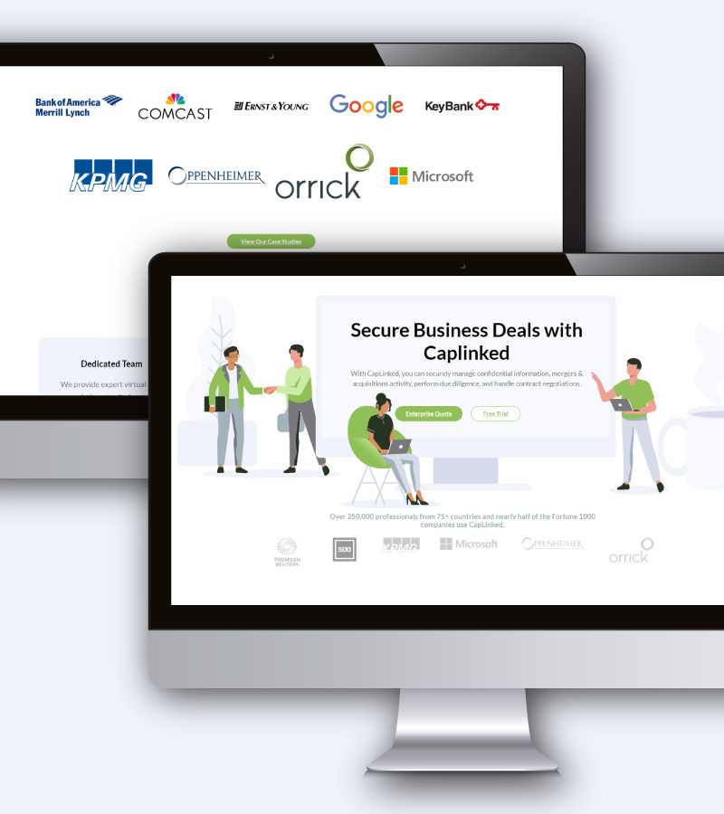
Utilizing white-space, rounded edges, and illustration graphics updated to their colors allowed the site as a whole to come together as a beautiful example of modern tech design.
The menu is among the most innovative of design elements, both allowing the simplification of a complicated existing site architecture in such a way that customers can have an easy and enjoyable user experience while simultaneously being an innovative solution to showcase the tech aesthetic further.
The homepage was designed to create a bold first impression that would catch the visitors’ attention while maintaining Caplinked as being a leader of the tech-sphere.
The internal pages reflect the design, featuring many more illustrations brought into the branding guidelines and giving an overall appearance of a smart and friendly tech product. This design spanned a dozen unique page designs, each with its own illustrations and architecture.
More from the Portfolio:
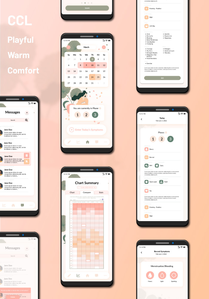
CCL
SaaS, App Design Calendar Design, Hifi Design
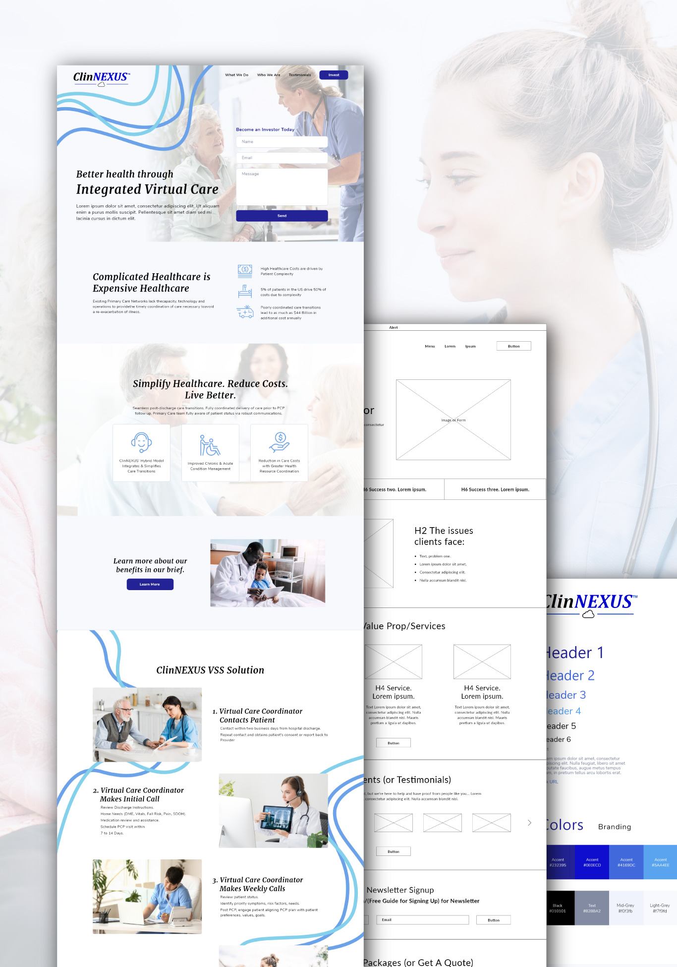
ClinNexus
A clean, modern design for a SaaS in the healthcare industry
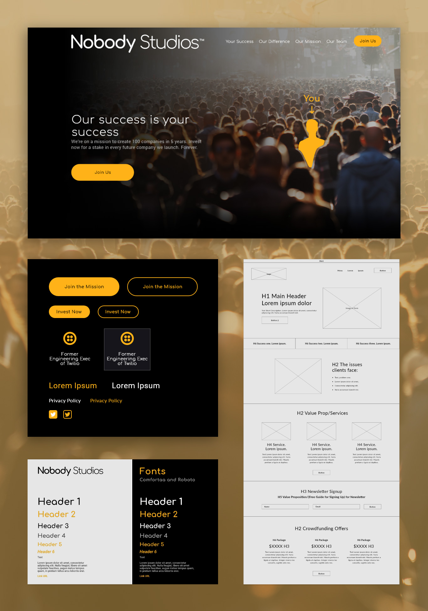
Nobody Studios
A clean and trendy website created for a crowd-venture capitalist startup