CCL: a tracking app for people with menstrual cycles
Product Design for Calendar and Data Display
Overview
CCL is an app meant to track menstrual and ovulation cycles with the goal of helping everyone with their monthly tracking needs. Whether a person wants to become pregnant, is hoping to avoid pregnancy, or just wants to track their menstrual cycle the CCL app will help.
Role: Lead Designer, Part of a Cross-Functional Team
Sector: SaaS, B2C, FemTech, Period Tracker App
Time: 12 Weeks
User Group: Women aged 25-45 looking to become pregnant, avoid pregnancy, or track their menstrual cycle
The goal of this design was to bring out a playful, warm, and comfortable side to the menstrual cycle. They wanted to help those with periods find peace in an app that can track it for you.
The client wished to avoid something too juvenile or something that looked too much like other period tracking apps on the market. They also needed the app to work for several different user groups. Although their primary user group is women looking to become pregnant, they also wanted their app to work for women looking to avoid pregnancy via tracking, and those who just wish to track their cycle.
CCL already had an existing app, and an existing client base, so it was also important to update functionality without confusing existing users. Their existing app was lacking any styling, as they had only been using it with user groups to find data and test their system.
Main Takeaway: a new, playful, comfortable, and feminine style was needed immediately for their product.
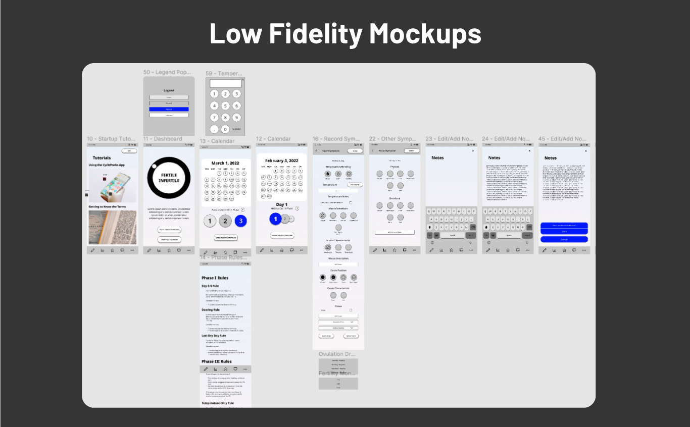
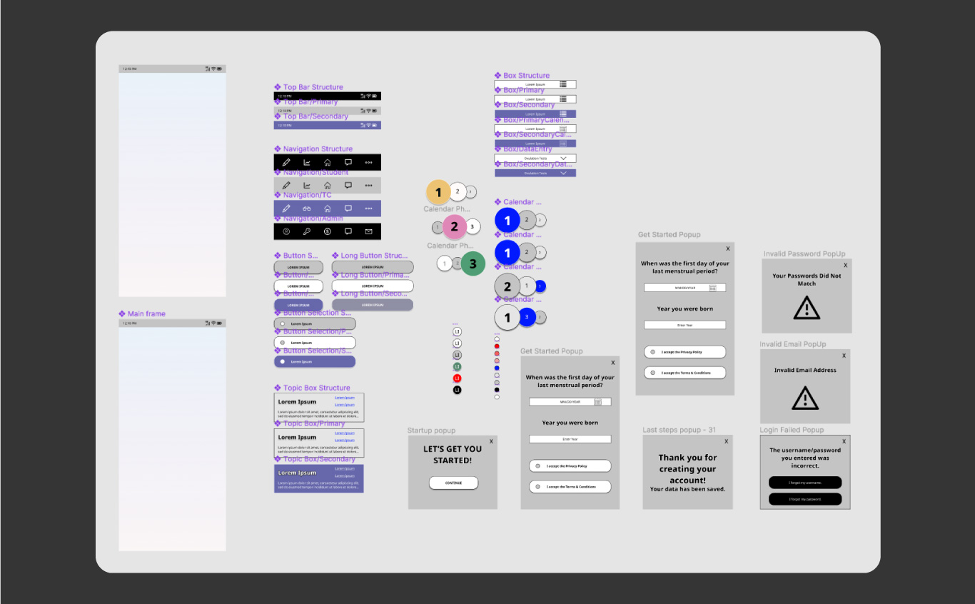
Lofi Mockups
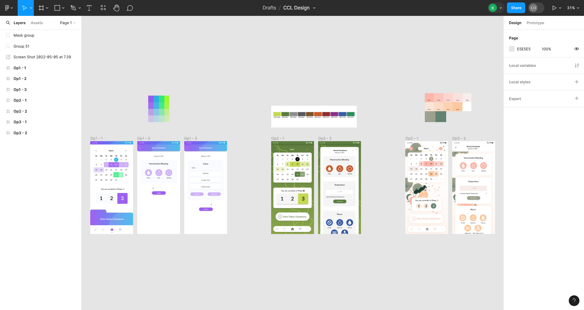
Iterations
Initial hifi design iterations (above). Second pass design iterations (right).
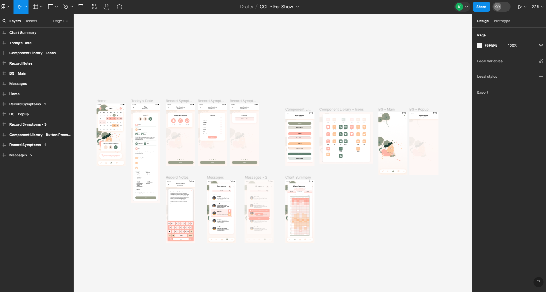
High Fidelity Mockups
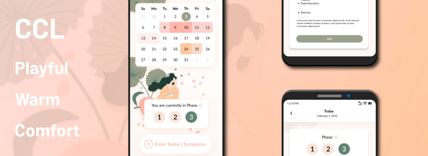
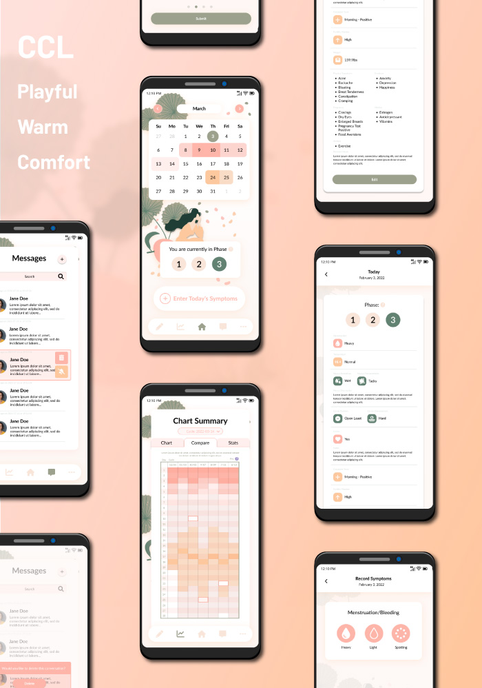
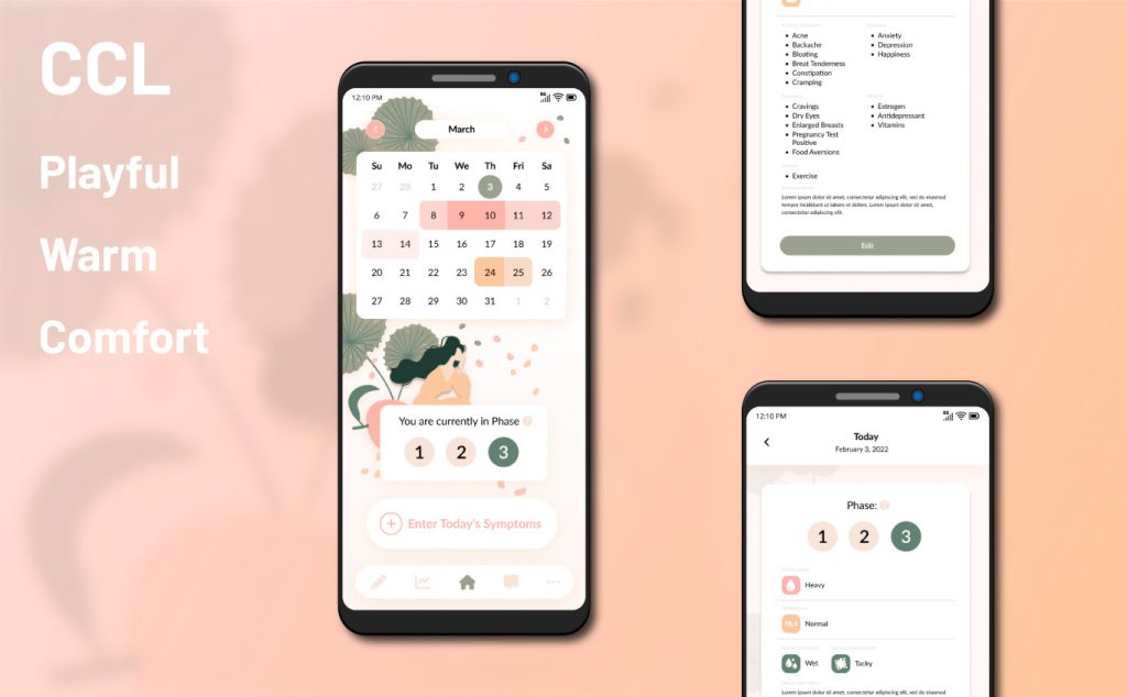
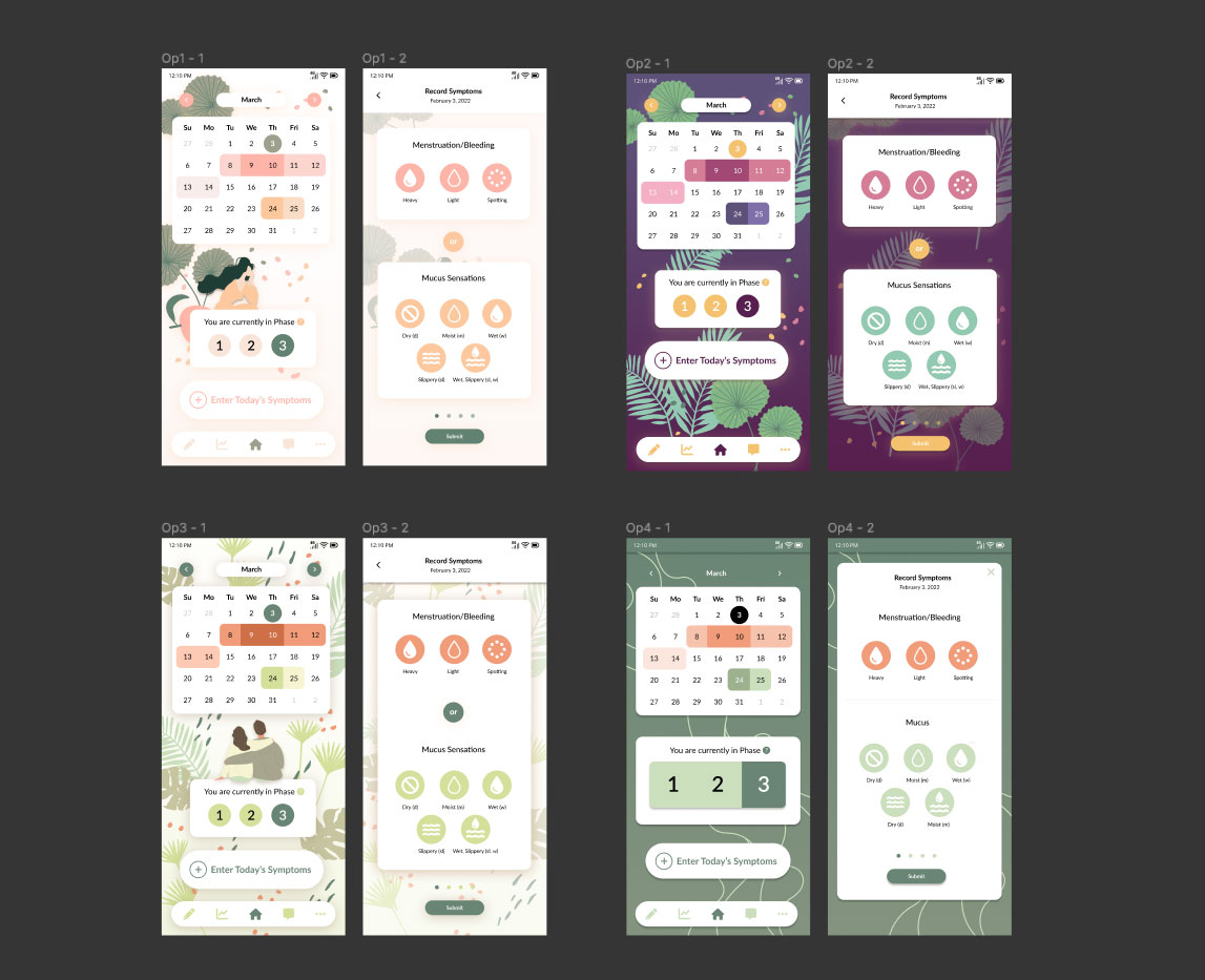
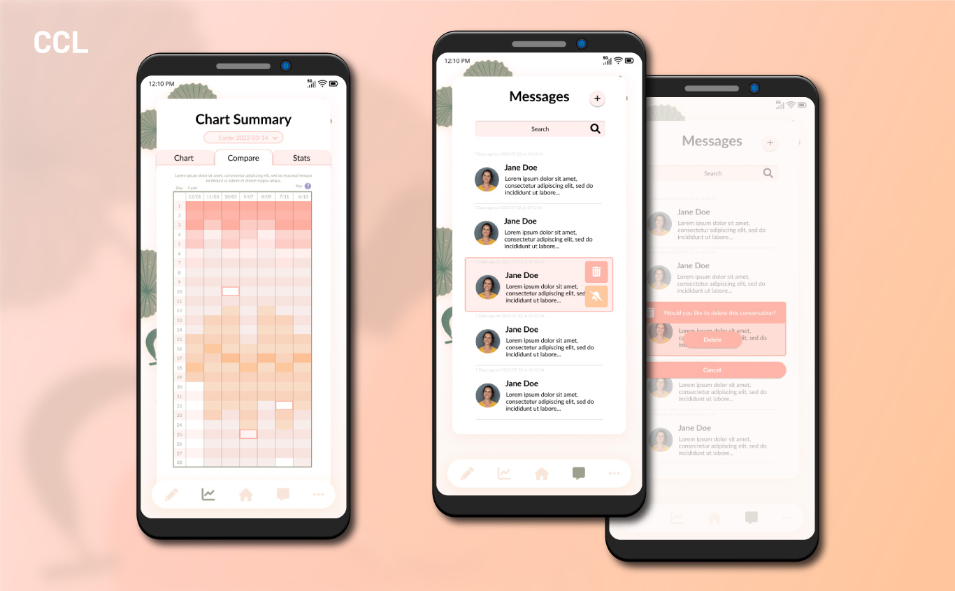
Designed in Figma, the overall design features a softer color palette. While it’s very feminine we wanted to avoid it being too juvenile, opting for an orange/pink scheme rather than an entirely pink scheme. The color palette was extremely important to get right. The green from the background elements also appears in many buttons to be able to diversify the styling for many types of buttons and alerts.
While the full design mockups are not available to showcase due to the company’s request, I have pulled in several of the designed screens into a separate mock-up for viewing.
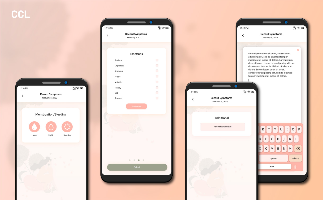
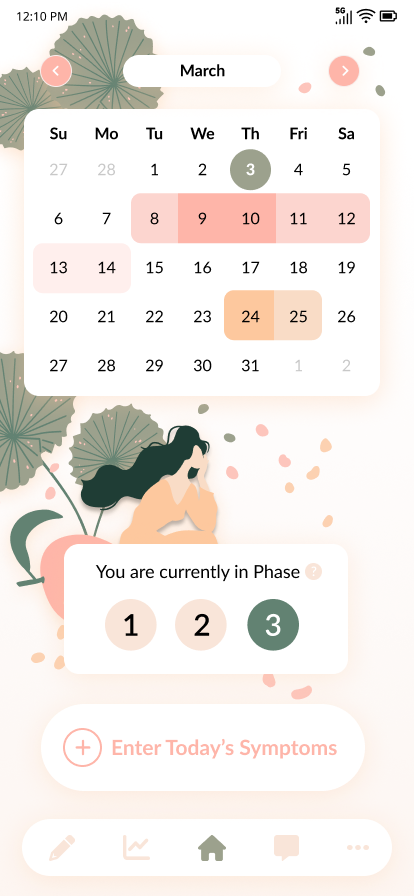
The most important element, and the element we started with was the homepage and period tracking form itself.
On the homepage the calendar needed to have several different color options with different meanings for each one. In a normal period tracker there might only be the colors for the current day and then for the period itself, with slight variations for light/regular/heavy bleeding. I included all three colors in the pink variation. For this app we also needed to include ovulation days so that those trying to get pregnant or trying to avoid pregnancy could get that additional functionality. I opted for the orange color to help differentiate it from the menstrual cycle. The current day I changed both shape and color to differentiate it from the other elements.
The phase tracker was the next most important element for those trying to get pregnant. It can be turned on/off in the settings depending on the user, since those using this as only a cycle tracker will have little use for the phases.
Below that it was important that the tracking was easy to access from the homepage since that was the primary functionality of the app. So I created the button “Enter Today’s Symptoms.” The client requested the wording of this button, so I tried to make it as clear as possible that it was a button and that it was important on the homepage.
More from the Portfolio:
ClinNexus
A clean, modern design for a SaaS in the healthcare industry
Caplinked
SaaS, Marketing Website Market Research, Competitor Analysis, User Research, Surveys, Persona Development, User Flows, Sitemap, Hifi Design
Nobody Studios
A clean and trendy website created for a crowd-venture capitalist startup