ClinNexus: A SaaS improving care transitions and reducing cost in the Healthcare Field
Making Healthcare Technology More Usable and Accessible for Older Clients
Overview
ClinNexus is an SaaS that is trying to bridge the gap between medical professionals and individuals seeking healthcare. The goal is to simplify the healthcare system and reduce costs so that people can focus on getting and staying healthy.
Role: Lead Designer, Part of a Cross-Functional Team
Sector: SaaS, B2C, Healthcare
Time: 12 Weeks
User Group: Medical staff are the purchasers, elderly and those with chronic illness are the primary users
ClinNexus was struggling with balancing the expectations between medical product design and tech design. They wanted something that nurses and doctors could easily use, and most medical design has extremely older styles that have not been updated in a long time. So the product needed to be reflective of these in the user journeys at minimum, so that nurses and doctors could quickly pick up and learn the product.
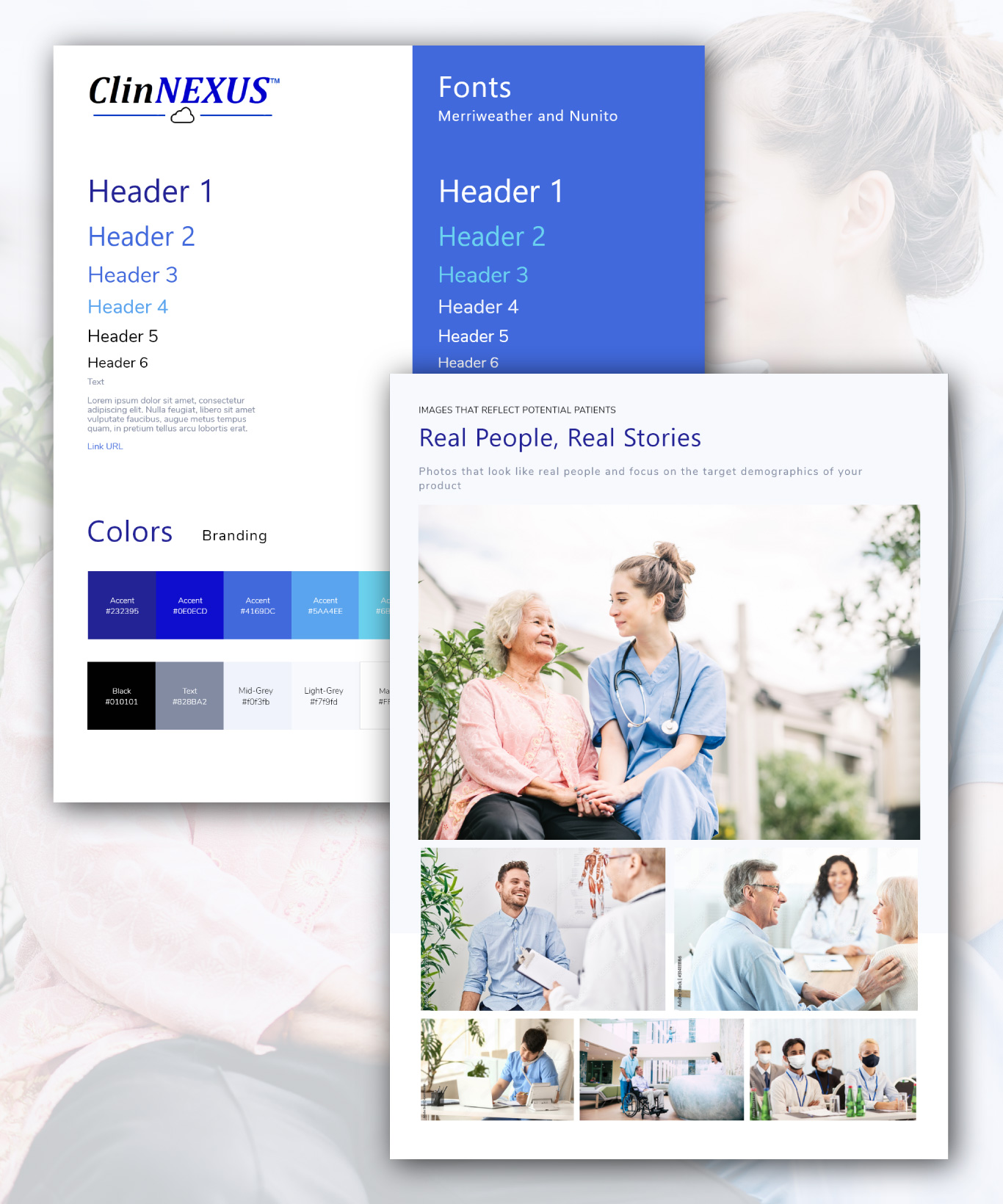
Tech has a very clean styling which they wanted to implement, the issue was that they already had existing branding, and had gone through the graphic design team first who had not communicated design choices with our team. In addition ClinNexus had a strict brand guide that I wanted to take to create a full design system. This design would inform product designs down the line, so it was of the utmost important to get this right. I needed to find the balance between their guide and what had already been designed for them from the graphic’s team to create a design system.
Main takeaways: Balancing the user groups and utilizing the existing guidelines into a design system, a new website, and a product.
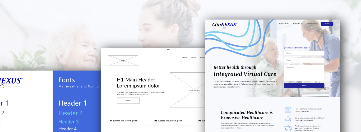
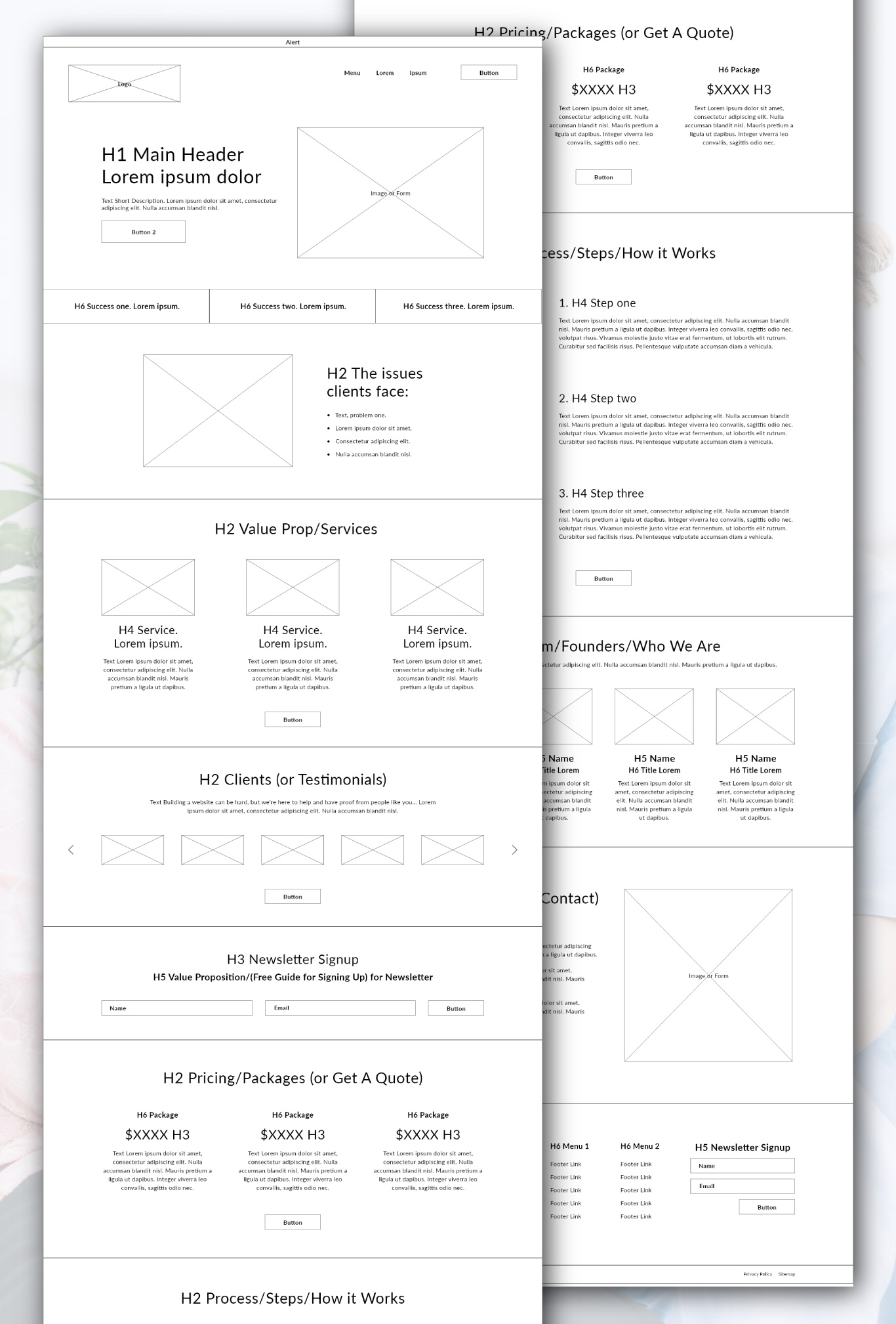
Lofi Mockups
Moodboard (below). Wireframe (right).
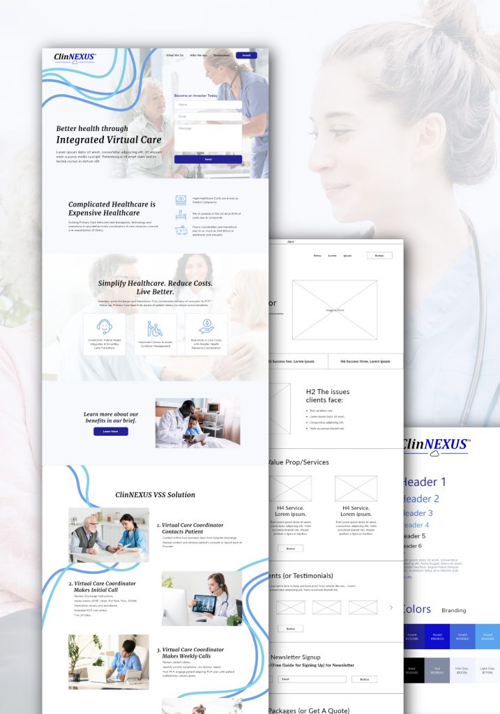
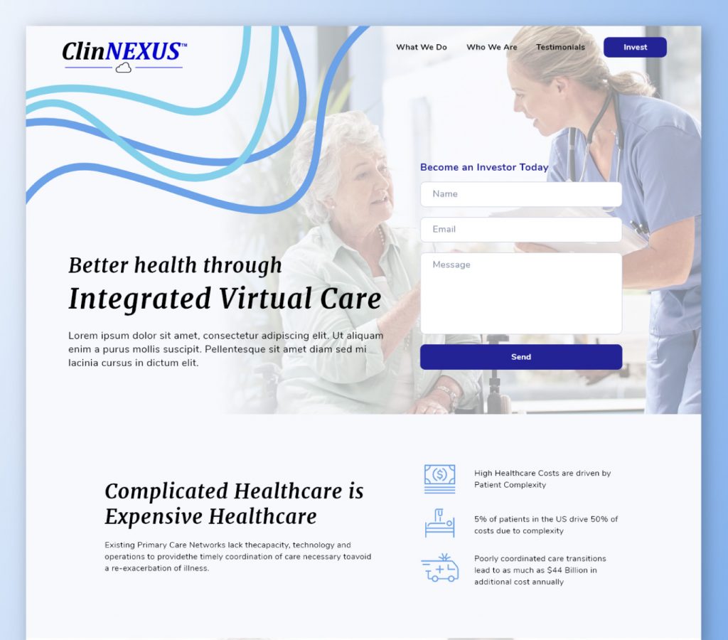
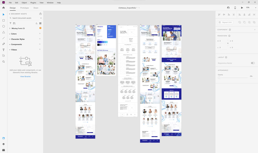
High Fidelity Mockups
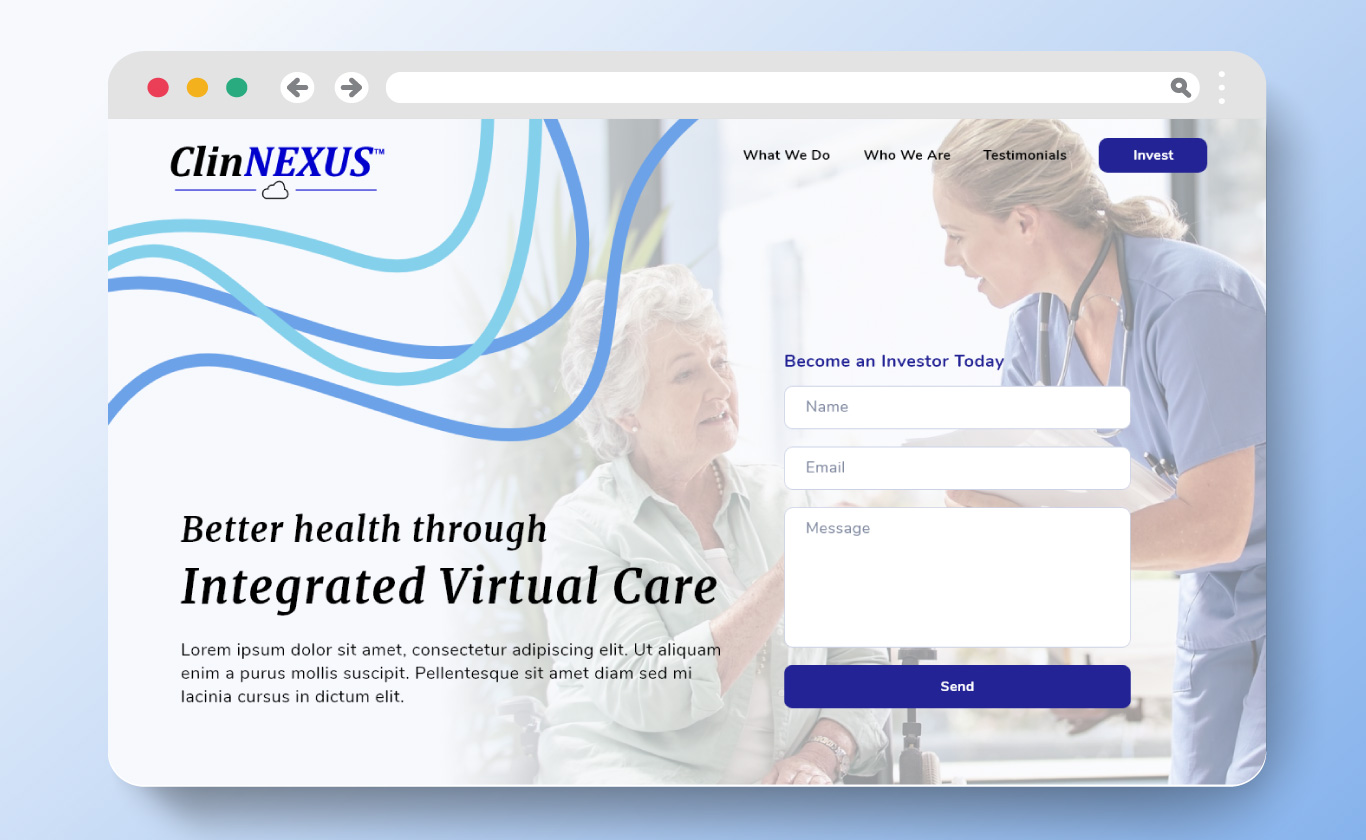
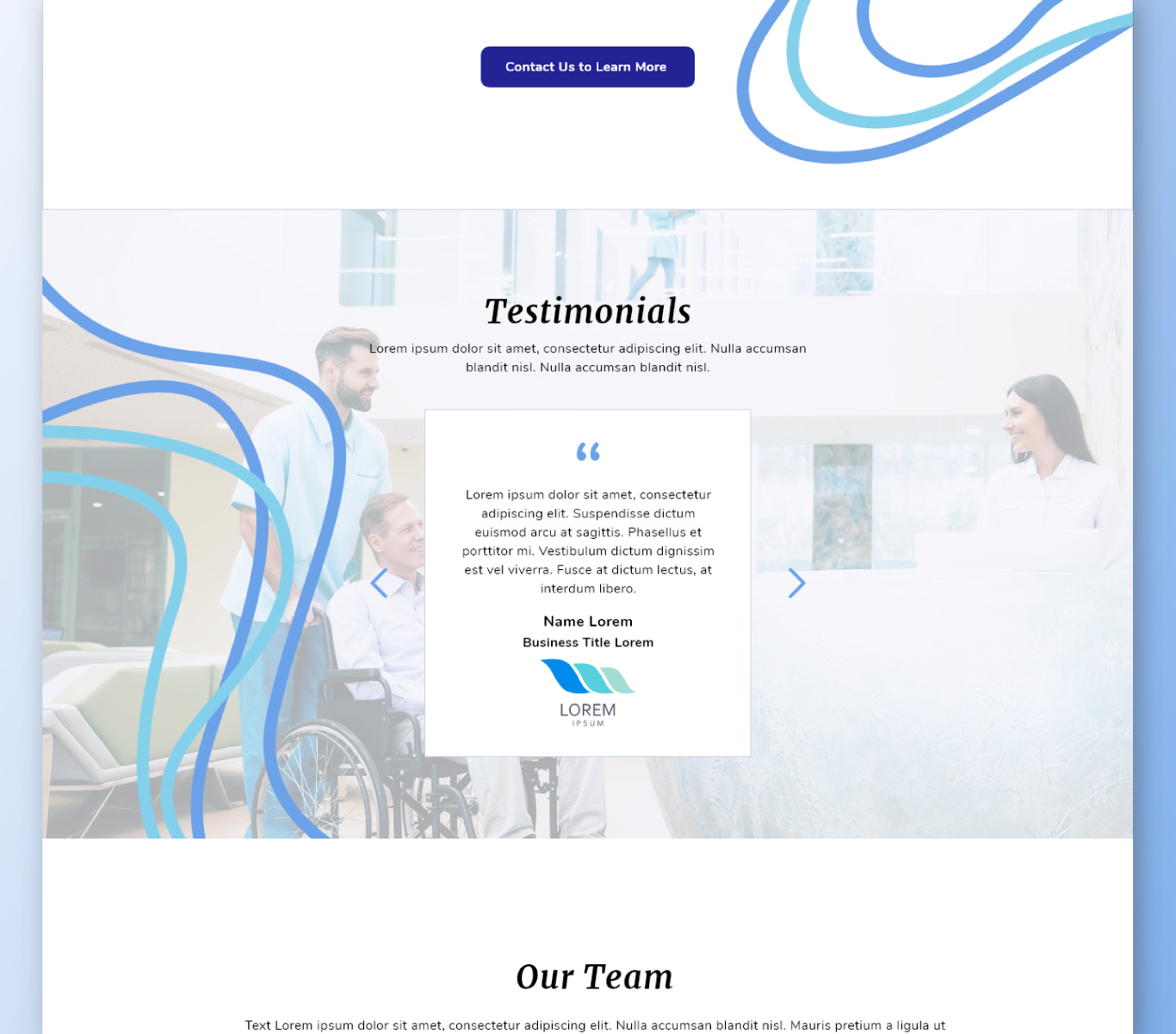
Designed in Adobe XD, the overall design of the website includes the finalized design, the moodboard, sitemap, and two design iterations.
ClinNexus had a strict brand guide. Their existing designs had artifacts that needed to be pulled over into the website design. This design would inform product designs down the line, so it was of the utmost important to get this right.
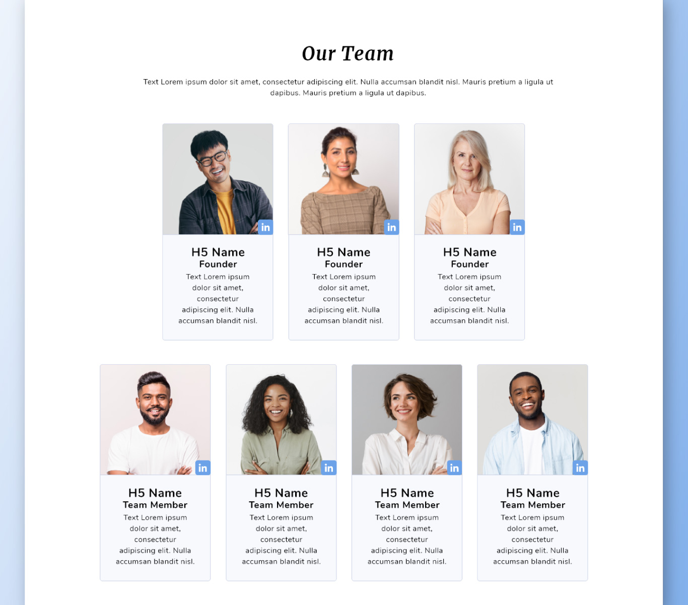
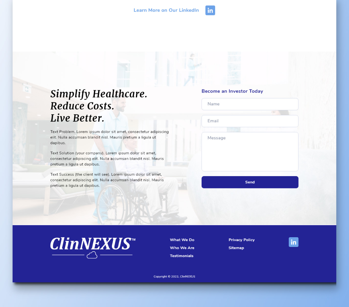
In the healthcare industry it’s very important to produce a clean design reminiscent of the clean environments of hospitals and doctor’s offices. The aesthetic helps to produce trust between the client and product. Ultimately the design ended up being very clean, very attractive, with lots of white space, while still maintaining the unique elements of this company’s design. I focused on imagery that was already telling the story of the type of client care we want to encourage with the app.
Because the design of this website will inform the product design, I wanted to make sure a component library was being developed alongside the design for use in the brand guide. I utilized a clear structure that could easily translate to the mobile responsive version, utilizing bootstrap and visual standards that could easily convert to differing screen sizes.