Professional Facility Solutions: a Facility Maintenance and Service Company
End to End Building of a Brand and Website
Overview
- Role: Lead Designer, Web Developer
- Sector: B2B, Industry & Commerce Services
- Time: 6 Weeks
- User Group: Brick and Mortar Businesses Local to Denver
- Tools: Figma, WordPress, Adobe Illustrator, WPEngine, HTML, CSS, PHP, Google Analytics
Problem
Professional Facility Solutions is a maintenance and servicing company for commercial and retail facilities in the Denver and surrounding market. They are a B2B company servicing brick and mortar facilities.
They were a brand-new company, meaning prior to this project they had no online presence at all, and no existing branding. They required a full-service strategy. There was a strict timeline on this project as they were already servicing companies but had no online presence. The branding needed to be clean, unique, and instantly recognizable.
They needed a logo, basic branding package, print design for a brochure and car magnet, and website. The website needed to be a one-page scroll site that was fully responsive, had connections to their scheduling app and contact form, was clean, well designed, and appropriate for the business.
Strategy & Research
There needed to be a mix of UX research and competitor analysis before the work could begin.
A survey of their existing clients gave me a quick idea of who I’d need to design for. The primary client looking at this site would be a business manager or secretary of a business in the Denver area. They needed a site with quick access to the most important information to them. It needed to look trustworthy, up to the existing standards in the industry, and have an easy way to contact or sign up for service. These clients are busy people who prioritize the first trustworthy company they find.
I was able to interview two existing clients in more depth to find what specifically would indicate a trustworthy company. The answers detailed cleanliness (both in site and imagery on the site), clarity of what specific services they provide, and existing testimonials of clients. They chose PFS specifically because it was a smaller locally-owned company with a more boutique approach to their clientele. The benefit is with the service a large company cannot provide to each client.
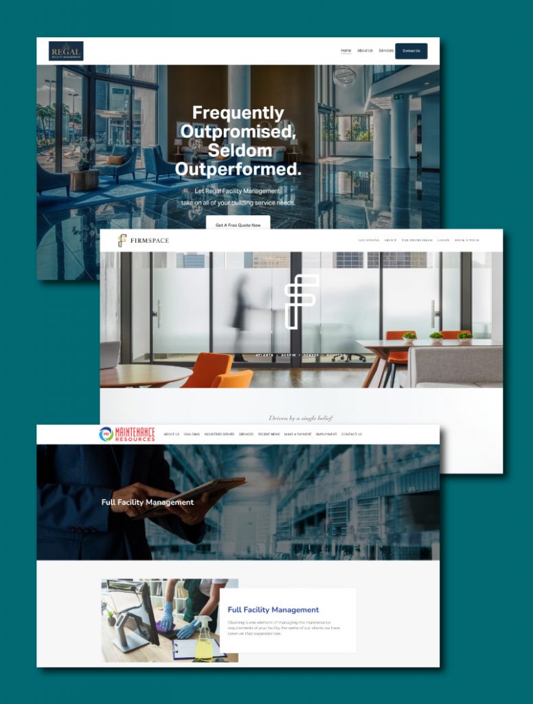
A competitor analysis found that there is a wide variety in the appearance of sites in this industry. The websites included a lot of white space and images of beautiful facilities. Much of the industry’s websites had illegible text, logos without clarity, and a general lack of consistent branding. By emphasizing those three elements I could push PFS to be among the best of their competitors.
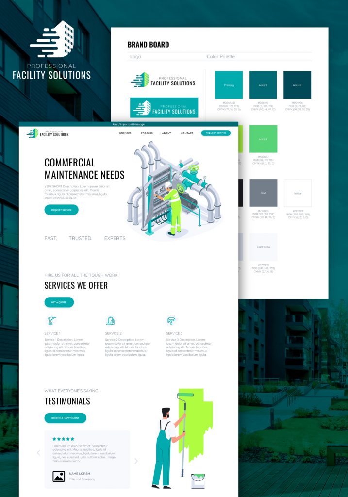
Branding
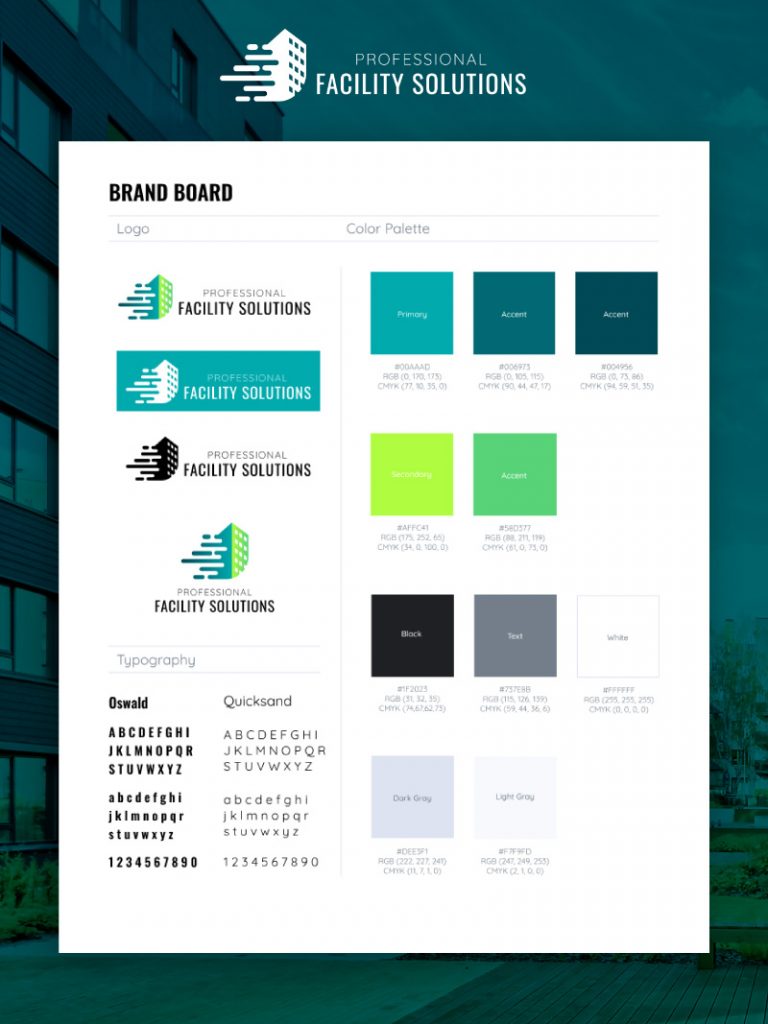
A basic branding book was developed along with the logo. The name of the company offers clarity,but they wanted a mark in addition that would indicate speed of service. I esigned the logo with this in mind, utilizing speed markings over-laying a building.
Because of the variety of competitors I wanted to include at least one unique color that would be reminiscent of only PFS, while still utilizing the blues that were very common among other facility management companies. I went with a bright green and blue combo.
The brightness of the green would also allow for very visible buttons and callouts. It would help lead the eye through the website and design.
For typography I went with Oswald as a header font and Quicksand as the text font. Oswald was reminiscent of some of the competitors font choices. It also has a less-corporate feel which was something the client wanted to emphasize, since they are a boutique business, not a large corporation. Quicksand was used as a beautiful companion font because of its clear spacing and geometric forms. Quicksand is extremely legible even at small sizes and has a large variety of font weights. It has rounded glyphs which feel approachable.
Both colors and typography were chosen with great care to the user experience. The brand board was designed in Figma.
Lo-Fi Design
Utilizing more research I decided that the best website flow strategy would be Storybrand flow, since this could emphasize both the most important details at the top of the page and also allow for featuring the ease of process and boutique nature of the company.
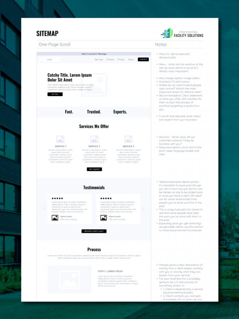
Since the site was only one page a full sitemap was not needed to track user-flow, instead I opted for a wireframe. I did utilize a user journey to figure out how a user would become a client and gave the client recommendations based on that.I would have like to have a direct sign-up through the website since ease of process was described as important to the clients.
They elected not to use a direct sign-up process at this stage in their business, going instead with the lengthier process of contact form > call > client sign up. This makes sense for their younger and more boutique business model since they can give more advice and direct their clients more effectively on a phone call, but it will lose them clients who want a faster on-boarding process.
To help with the chosen process I included a process section in the low fidelity design so that potential clients could easily and clearly understand how they could sign up for services, since there were multiple steps. This helps with ease.
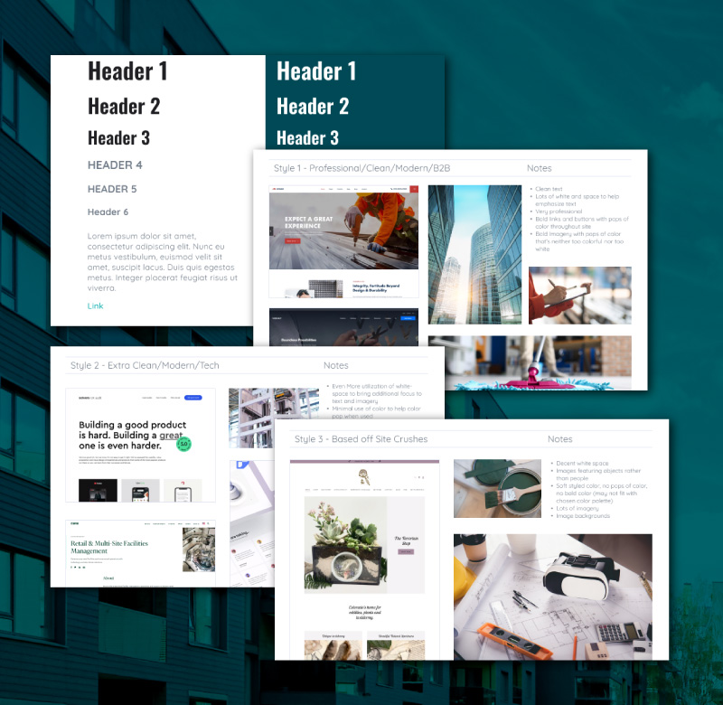
A moodboard was designed for additional clarity of communication between the client and me. I wanted to be absolutely certain that there were no issues with the fonts chosen, but also that I understood the direction they wished to take the site.
There were three main styles of design based off of the client’s desires and the user research I had previously completed. The main style I wanted to use was a professional, clean, modern style. This was what I was seeing from the competitor analysis and that would do the best one at representing PFS as the trustworthy company their clients needed.
The second set of moodboard images was for a more modern tech style. This wasn’t one I saw in the competitor analysis, but I saw an opportunity to utilize this sort of style to pull the unique aspect of the company (the boutique style of services they offered) more front and center.
The third style was based off of the client’s site-crushes they had initially sent me. The sites they liked were very different from what I was seeing in both the competitor analysis and the user research. I utilized the moodboard to showcase how I could design in this way, but how I thought the other two designs might better succeed based off of research and analysis. The client did decide to drop the third style after this moodboard since they agreed it didn’t meet their needs as well as the other two.
Hi-Fi Design
Part of the process of design is making sure to have multiple options for clients. I generally design between 2-3 options so clients can see the potentials of each option. Both options were designed in Figma.
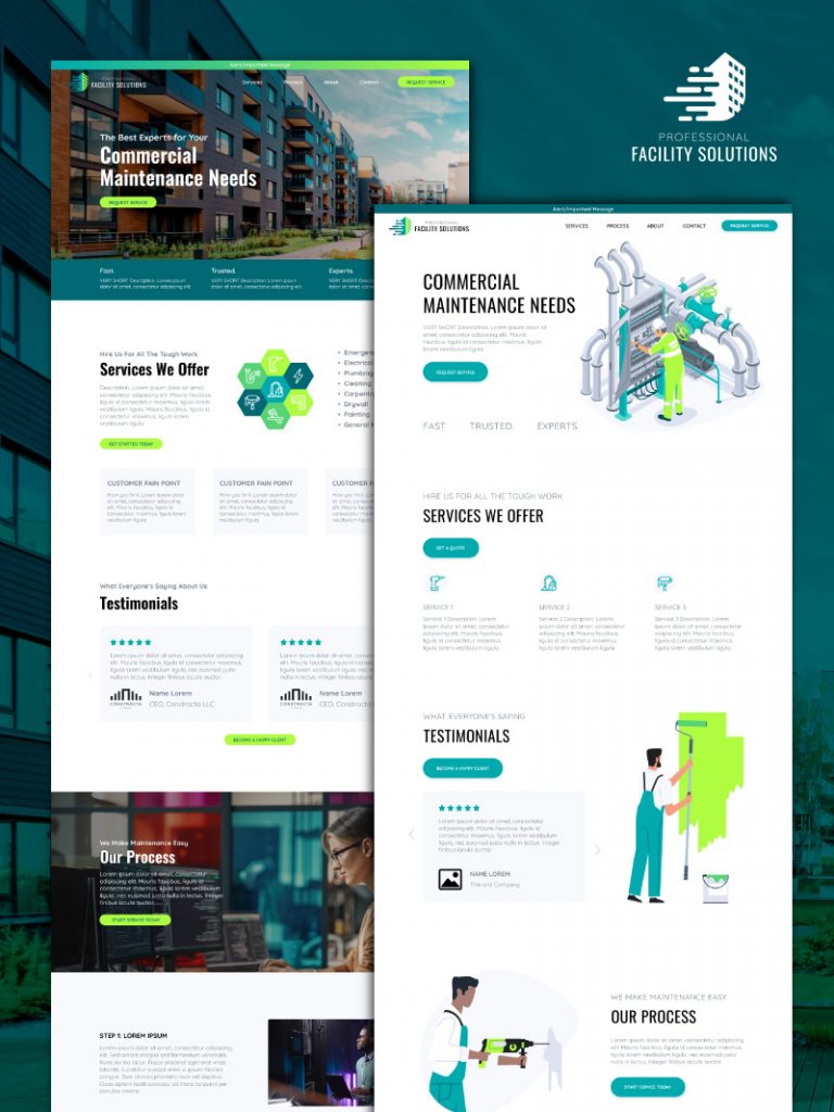
As described in the moodboard, the first option was styled after thee competitor analysis with a very clean, modern approach.
The second style kept the very clean approach, utilizing corporate imagery in the client’s colors. This is more reminiscent of a tech-styled website or app, but the corporate imagery still pulls the B2B feel that I wanted.
Two very different approaches. This was another time I utilized my user research to make sure that the correct design was chosen in the end. While both designs polled well, the first design definitely gave the aesthetic that felt more trustworthy for a local B2B service company. The client also chose the first approach for the final site as their preference, even before showing them the research.
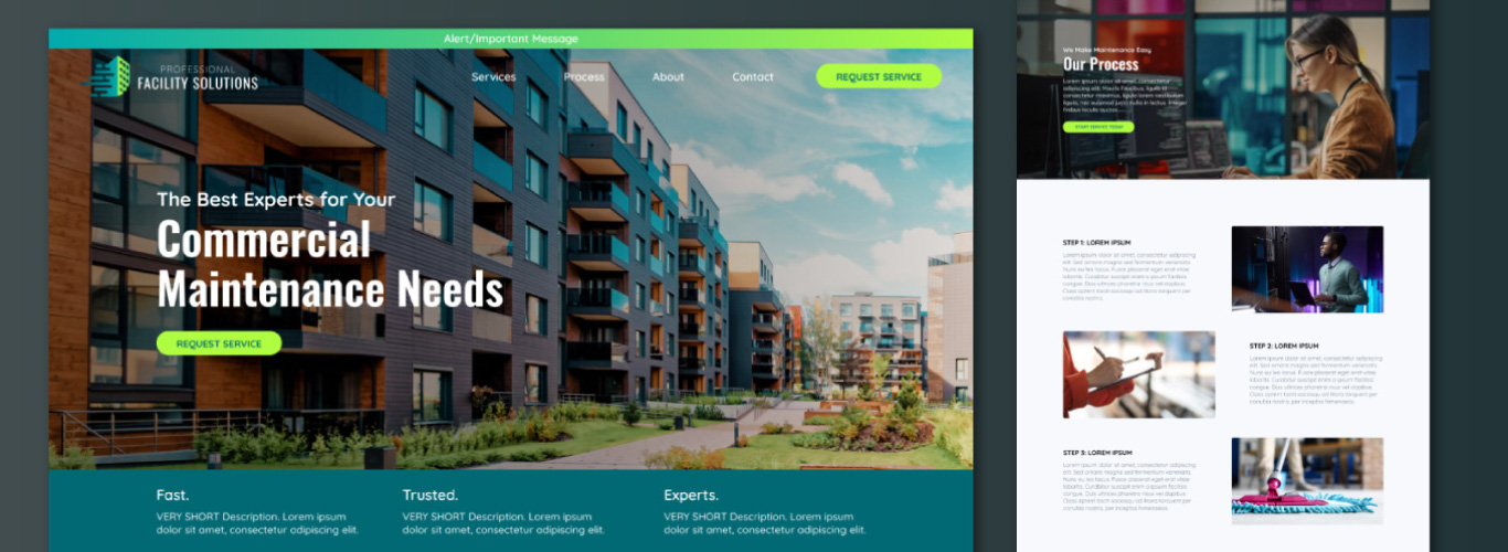
As you can see from the design the buttons are extremely vibrant on the first design as well. This really pulls the eye through the site and directs the users to the buttons which are the most important feature of this design. The fully rounded edges of the buttons pulls the eye into the center of the button. The other parts of the page that pull the eye are the headers and the images.
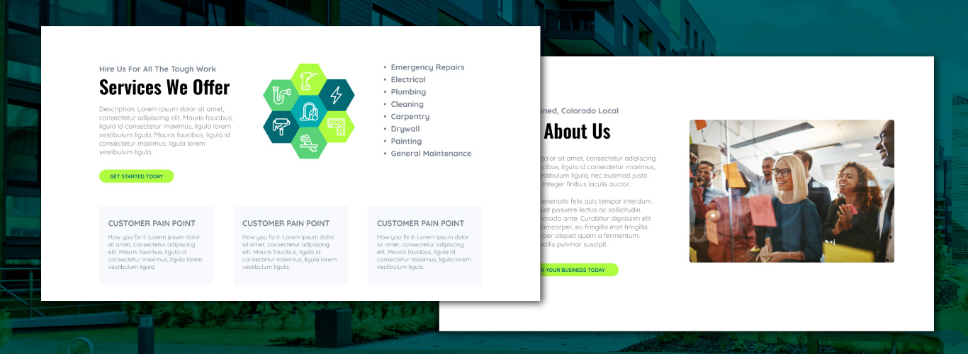
It really gives a great sense of hierarchy. This helps increase the speed the user can find the information that is most important to them, which if you remember is one of the most important features for the users that I interviewed. The text is a dark grey rather than a flat black increasing the hierarchy of the page, but also helping with eye strain for users who do want to read the larger descriptions. The dark grey is still dark enough to keep the recommended accessibility contrast ratio of 4.5:1.
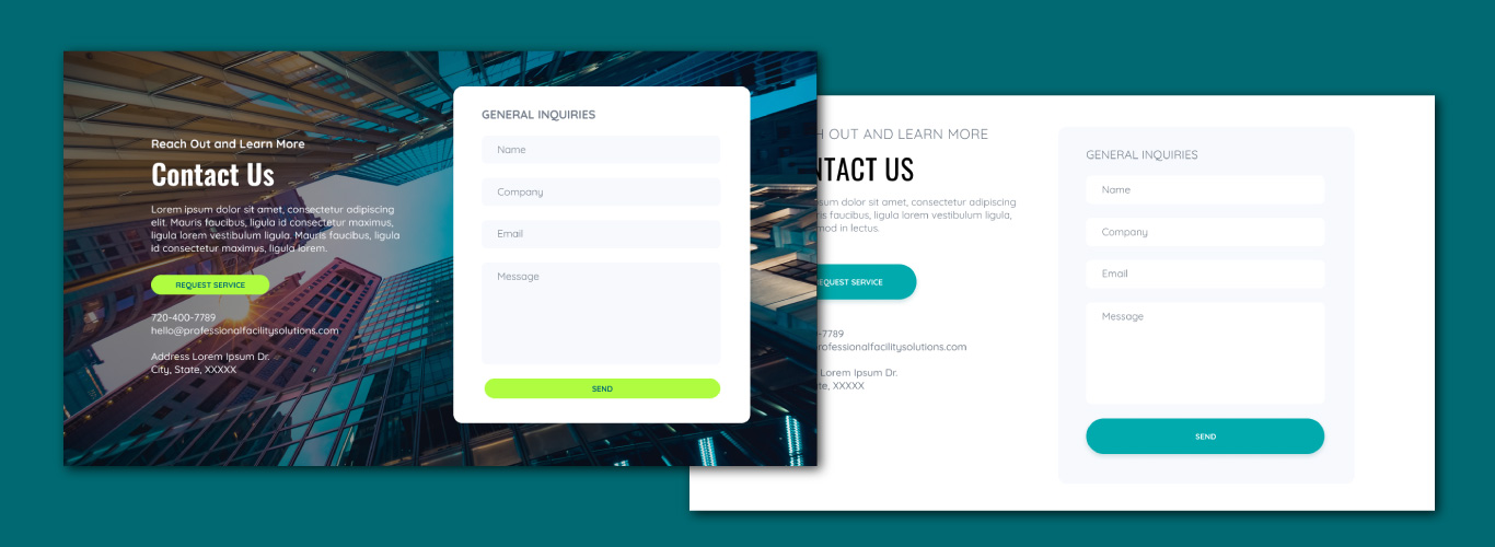
The contact form was one of the most important parts of the site. For both design versions the contact form is very clean and modern styled. You can see how the use of Quicksand font benefits the form through its ability to be read at small sizes and its rounded serifs. The round serifs compliment the rounded edges and friendliness of the form.
For the first design I wanted a way to make the form stand out more than the other sections of the site. I went with a photographic background to do this. It does sacrifice some legibility in the text that’s overlaid directly, but really directs the eye to the form, since that’s what the client really wanted a user to complete.
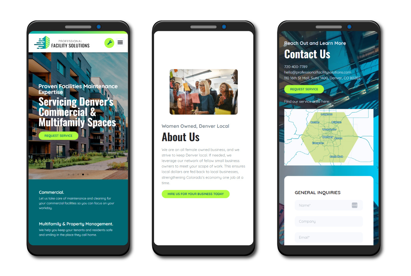
The site was designed fully responsive utilizing a grid approach. Column and gutters were applied prior to the initial home page design. Because of the speed of this design the client opted not to utilize a version of the mobile on the Figma. Although this added to the development time it did reduce the design time. Above are screenshots of the live design in a mobile format. Because of the way that I design with the mobile design in mind the entire time, it wasn’t an issue to skip the mobile version of the design and go directly into development.
Development took 1 week, with a second week added to QA the website and make sure everything was running smoothly, especially the forms and links to the scheduling app. The website was built in WordPress, since I felt it appropriate so that the client could easily grow the site over time. Their next phases were going to be adding plugins that existed with WordPress but not all of the other CMS. WordPress is also the CMS I am most comfortable developing for.
The final step was a client walkthrough of the back-end of the CMS.
End-to-end this project took 6 weeks. 2 weeks were given for the logo and brand design and initial user research. 2 weeks were given from wireframe to finalized design. The last 2 weeks were spent in development.
More from the Portfolio:
Nobody Studios
A clean and trendy website created for a crowd-venture capitalist startup
Emerging Women
Web dev operations for a global leadership company of 50k members